I'm fairly new to the concept of grant making.
I am unfamiliar with the way they run, how they are regulated, if at all, where and how funders get funding, who benefits from them - you get the idea. I do know they are a big deal; big money supporting big issues, causes and projects for all levels of people and organisations.
This was more a learning exercise than an investigation into a sector that plays a huge role in the everyday of so many individuals, largely behind closed doors. With the 360Giving open standard, this will hopefully no longer be the case.
I decided on a process of using GrantNav as a civilian; whittling down my searches using the filters, downloading the CSVs and tallying up the results in Google Sheets. I used Inkscape to create the visualisations - on the plus side, the graphs were not generic but designing took a week to finalise.
Majority of the time was spent pondering on just the one question - what could be shown from the data?
There is quite a substantial amount of data to process manually. At first, I thought it would be interesting to pit Regions against each other - mostly to see what is being funded the most in each - but the overviews showed that most of the funding went to the same thing, regardless of region; highway maintenance.
Instead I decided to limit the search to the years post-2000 for Yorkshire and Humber so that brought it down to slightly over 20k to work with. Why those two specific filters? I live in Bradford so it would interesting to know what’s being funded around me after the millennium.
Trying to make sense of the data at this point became a struggle - I wasn’t sure what I wanted to visualise; was there a story to be told from this chunk of information? Tabs of csvs were imported and analysed - 20k grants is still a huge amount to process manually - maybe I need to look closer.
It took a fair few goes of iteration and redoing all the graphs several times before the results became manageable. This was mostly down to a misinterpretation of the GrantNav filtering system where the sorting was assumed to be based on the highest amount first - this was not the case since it is sorted by the highest instance of each filter. It was the middle of the week before I realised my mistake.
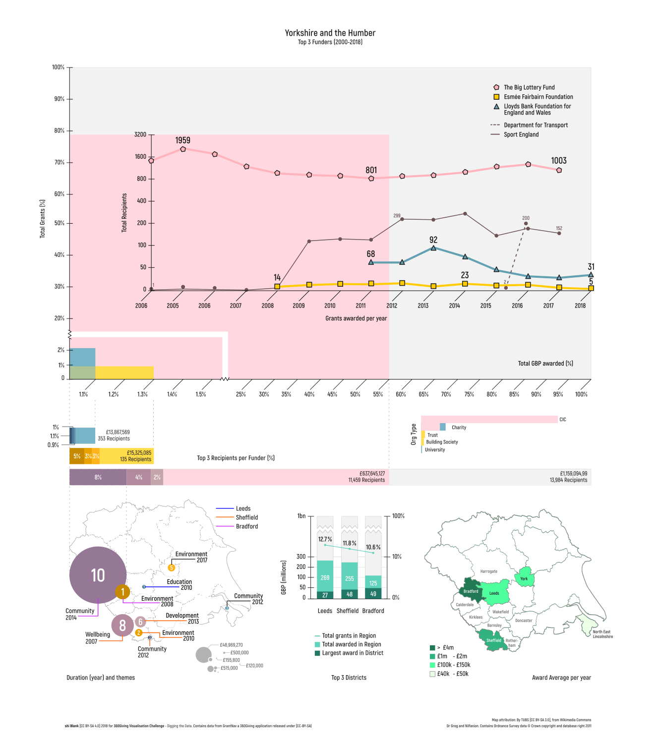
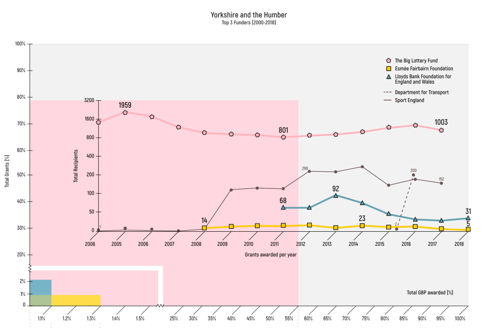 Figure 1. Top 3 Funders area graph
This is an area graph that shows you how deep The Big Lottery Fund’s pockets are compared to everything else but they also give to far more recipients than any other funder in the region.
As an artist who benefits from some type of funding, the concept of financial support from gambling addiction is highly conflicting. Is this a necessary evil?
I looked at funders that gave at least £10 million - this shrunk the results to 5 funders which included grants for highway maintenance and funding for buildings. Plotting the line graphs, I notice that not all funders publish equally; highway maintenance account for a huge amount of funding (second largest) but for the shortest amount of time (1 year). I’ve decided not to include the funders of either grants so this left me with the top 3 funders. I thought this seemed like a good direction to head for - 3 funders, 3 districts, 3 regions.
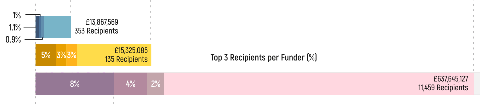 Figure 2. Top 3 Recipient per Funders bar chart
The top 3 recipients for the pink bar (The Big Lottery) accounts for 14% of all the funding. On average, each recipient receives about £56k but these top recipients received £49 million.
However, this really isn't a fair assessment as the largest grant is for a duration of 10 years.
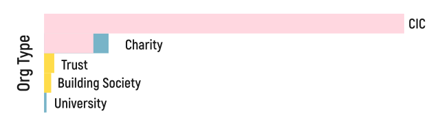 Figure 3. Organisation types
Most of the funding went to Community Interest Companies and funded by The Big Lottery.
Within the dataset, the Organisation Type field is usually filled with, “Charity” or left empty so I had to look up the NCVO Almanac to figure out what organisation types are out there - even then, the tome of knowledge was overwhelming and there isn't an official standard to refer to.
In the end, I had to manually search each Recipient for information on the internet and derive a type from their website or from their profile on the Charity Search website. To be fair, most funders do include a clue in their names, unless you’re The Big Lottery or any of the funders included in this list.
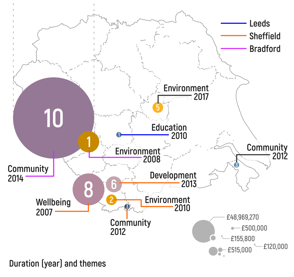 Figure 4. Which themes are funded where for how long and how much
Themes were hard to determine. I couldn’t find an official list of classification to use as reference so had to use well known themes found in reports and findings listed in the Resources links. Laying out the grants with all the context on a map made it easier to understand the region. I’m sure if all 20k grants were laid out here, you might find something worthwhile to consider.
On the other hand, it’ll just end up being a really crowded map. One thing’s for sure, I’ve learnt a great deal more about the geography of the region by doing this exercise.
I think what would be more interesting is if another dataset is used in conjunction with this view. Sheffield really stands out in its diversity of themes.
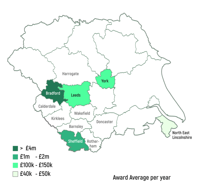 Figure 5. Intensity map based on average amount awarded per year
Funded programmes run for a wide range of durations - mostly 12 months. I wanted to know the index of a district to see how much is being funded on average.
At this point, it would be really useful to compare a similar view with somewhere like London, Scotland or Wales and maybe combine it with the deprivation index.
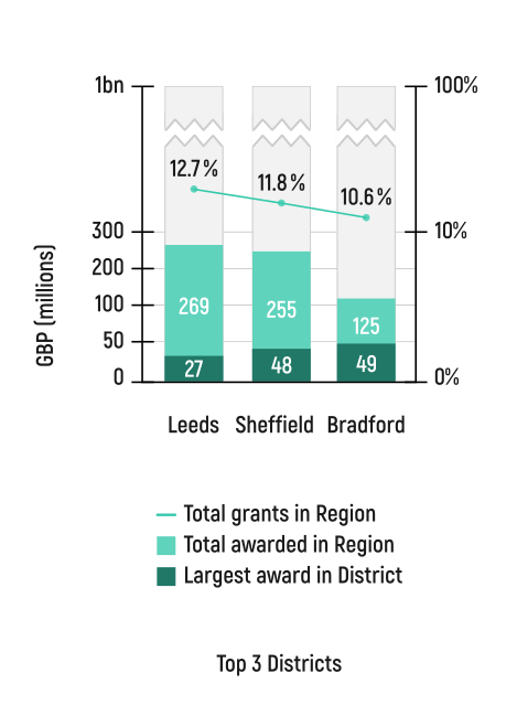 Figure 6. Districts comparison
The top 3 districts make up 50% of the entire funding amount but just over 30% in number of grants in the Region. Leeds and Sheffield were granted similar amounts with Bradford at under half the amount of either funders.
It’s also worth noting that 40% of Bradford’s entire funding amount is attributed to just the one recipient.
So what did I learn? It’s fantastic that funders are being more open about the way they operate but there are still major gaps in the data that limit the full potential of the cause. For example, the largest grant to Bradford which accounts for 8% of the entire Big Lottery budget went to a project without a description, denying us some context of this grand gesture unless one trawls the internet for answers.
A pdf (300kb) of the entire visualisation lives here.
The End.
Contains data from GrantNav a 360Giving application released under the terms of the Creative Commons Attribution Sharealike license (CC-BY-SA).
Dr Greg and Nilfanion. Contains Ordnance Survey data © Crown copyright and database right 2011
_-_de_-_colored_(-London_zoom).svg)